I’ve seen a lot of impressive animated bar charts(i.e. Bar Chart Race) and was wondering how they were created. After extensive research, it turned out a lot of tools offer this feature, such as Tableau, Flourish(web-based), Canva.com; however all of them have a price tag; and/or with limitations for example only embedded in HTML but not a standalone mp4.
At the end, the only free options are via coding, fortunately very few lines of code in Python 🙂
Below are the two options that are FREE & easy to use in Python:
sjvisualizer is a standalone package that can read data in Excel, configure a few attributes(such as canvas size, title, position) and output the final file into a .mp4. It’s a lot easier and light weight comparting to bar-chart-race. Below is a sample code
from sjvisualizer import BarRace
from sjvisualizer import DataHandler
from sjvisualizer import Canvas
from sjvisualizer import Date

file_name = "../DesktopOS.xlsx"

df = DataHandler.DataHandler(excel_file=file_name, number_of_frames=3600).df
canvas = Canvas.canvas()

bar_race = BarRace.bar_race(canvas=canvas.canvas, df=df)
canvas.add_sub_plot((bar_race))
# add static text
static_text = canvas.canvas.create_text(720 / 2 + 150, 100, text="Most Followed Instagram Accounts",
                                        font=("Purisa", 30))
# add time indication
date = Date.date(canvas=canvas.canvas, x_pos=250, y_pos=1000, width=0, height=50, time_indicator="year", df=df)
canvas.add_sub_plot(date)

canvas.add_sub_title("sub title")
#square = canvas.canvas.create_rectangle(0, 0, 1080, 1080)


#canvas.play()
canvas.play(record=True)
bar-chart-race is not hard either but it requires Pandas to read input file; FFmpeg to generate the output mp4. (Technically speaking, I believe sjvisualizer needs these two modules too but it packages them by itself so end users don’t need to install them separately)
Installing FFmpeg could be challenging because the project only releases source code so you’ll need to either compile the code yourself(most users don’t and will never do) or download the compiled version based on your operating system.
On Windows, the below steps are probably the quickest:
- Head to ffmpeg’s official website
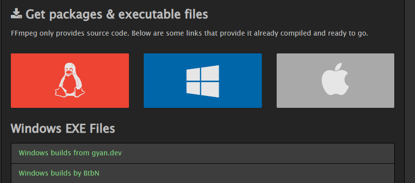
- Choose “Windows EXE Files”

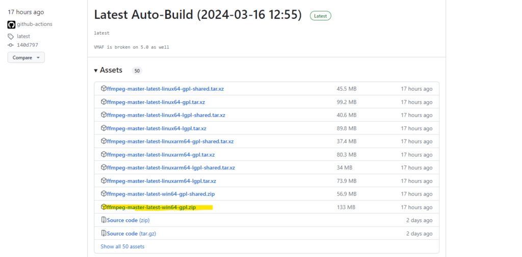
3. Choose “Windows builds by BtbN” and on the follow-up page, download ffmpeg-master-latest-win64-gpl.zip

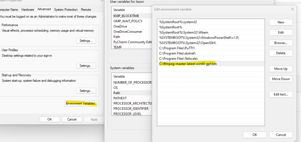
4. Unzip ffmpeg-master-latest-win64-gpl.zip into any folder on Windows and then add its “bin” folder into your Windows PATH; For example I unzipped the file to C:\ffmpeg-master-latest-win64-gpl and then I added this C:\ffmpeg-master-latest-win64-gpl\bin to my Windows PATH

5. After a system reboot, (or an editor reload), your python code should be able to use FFmpeg, below is the sample code
import pandas as pd
import matplotlib.pyplot as plt
import bar_chart_race as bcr

filename = '../DesktopOS.xlsx'
data = pd.read_excel(filename,
                   index_col=0, na_values=['-', 'D'],
                   parse_dates=True)
#data.head()

df = data

bcr.bar_chart_race(
    df=df,
    filename='os_brc_demo.mp4',
    orientation='h',
    sort='desc',
    n_bars=5,
    fixed_order=False,
    fixed_max=False,
    steps_per_period=10,
    period_length=500,
    interpolate_period=False,
    label_bars=True,
    bar_size=.90,
    period_label={'x': .99, 'y': .25, 'ha': 'right', 'va': 'center'},
    #period_fmt='%B %d, %Y',
    period_fmt='%Y',
    period_summary_func=lambda v, r: {'x': .99, 'y': .18,
                                      's': '',
                                      'ha': 'right', 'size': 8, 'family': 'Courier New'},
    perpendicular_bar_func='median',
    figsize=(5, 3),
    dpi=500,
    cmap='dark24',
    title='OS marketshare, 2003–2021',
    title_size=10,
    bar_label_size=7,
    tick_label_size=5,
    shared_fontdict={'color' : '.1'},
    scale='linear',
    writer=None,
    fig=None,
    bar_kwargs={'alpha': .7},
    filter_column_colors=True)